Chūmoku
Chūmoku is a colour-based alert system, targeted towards alleviating stress and improving the mental wellbeing of chefs in the food and restaurant industry. This concept was created with some friends as our entry into the 2017/18 RSA Student Design Awards.
Working in the food industry is mentally taxing for chefs as they constantly have handle high stress situations alone.
We have seen this project through from ideation to creation. You can view the product video here.

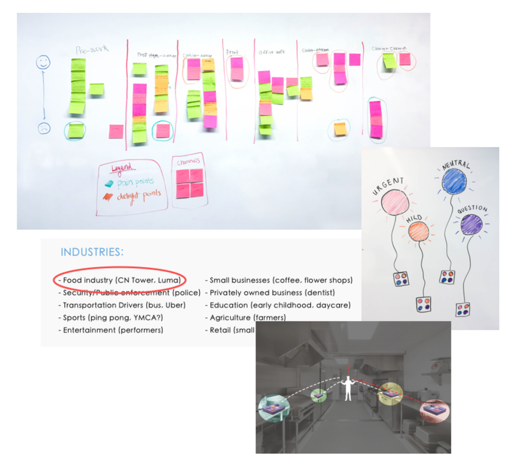
Through research, we found that communication was often affected by the mental health of the people working in the kitchen. This was something we wanted to attack because verbal abuse was one of the results of this atmosphere. Chūmoku aims to provide an alternative method of communicate between kitchen staff and the head chef.

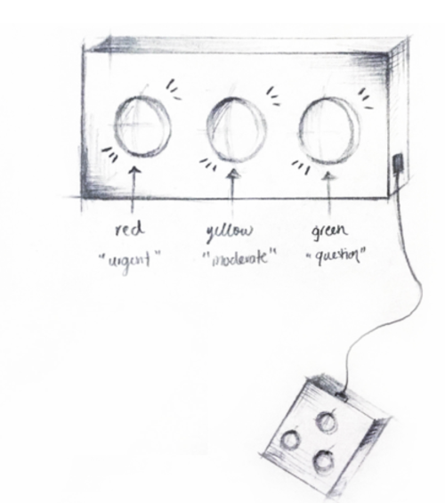
Initially, the design consisted of three lights and three buttons; red being the urgent and immediate call for help, yellow as a moderate request and green for a quick question. After conducting a usability test, I realized that red and green colours were unable to be detected by those with colour blindness.
Having three lights also proved to be ineffective and a waste of space, taking into account the possibility of compact kitchens with limited space. Therefore, I changed it into a single light that changes colours instead, based on the button pressed.

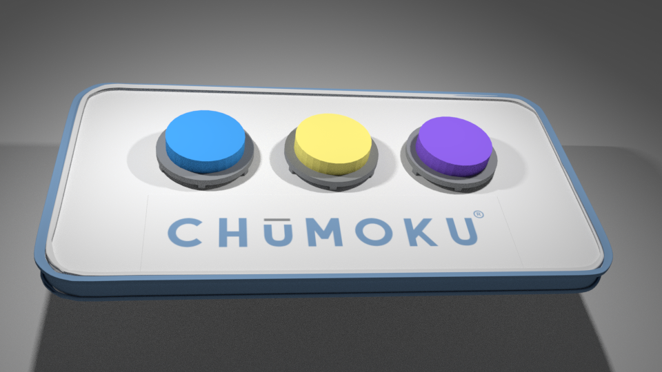
In the second iteration, I accomodated colour blindness by changing the three colours to purple, yellow and blue. To further make each light stand out, a symbol would be paired to each state. In the event that the colour is hard to see, the symbol being shone can still communicate the signal being pressed.

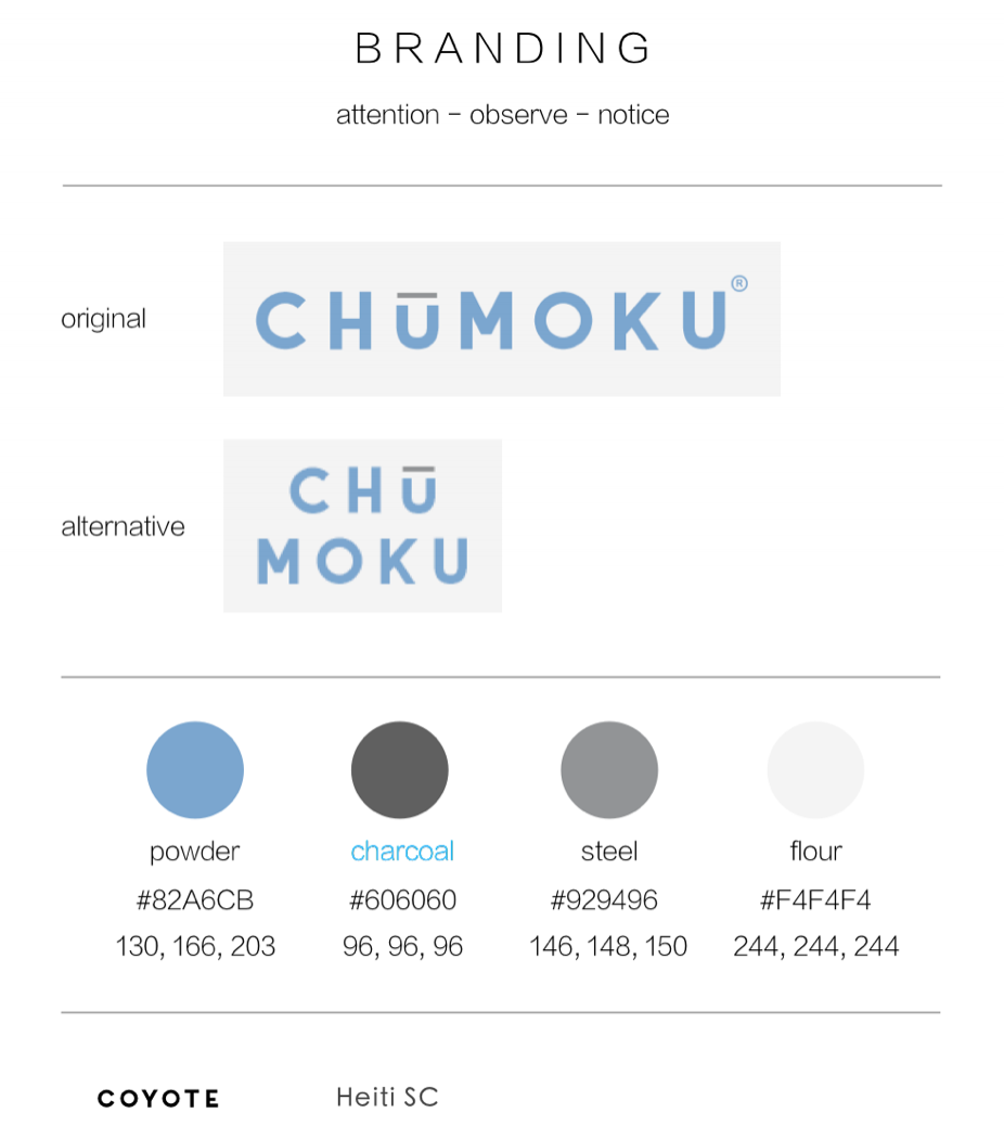
Inspired by Japanese kitchenware, Chūmoku's direct translations are "attention", "observe", and "notice." The translation is now used as our brand's slogan and provide the public with a general idea of our product. Chumoku is an easy-to-use alert system that utilizes a series of coloured lights to alert the head chef of their staff's status: purple represents an urgent call for help, yellow is a moderate request, and blue is simply a quick question. Each time a button is pressed, the data is recorded into a system and can be displayed on a monitor for analytical purposes.

Some takeaways A project like this gave the team a huge amount of creative freedom but at the same time, a greater amount of responsibilities to handle. This project was ideated and created using agile methodologies so getting feedback was crucial to the success of this project.